Shape Fun!
CSJP

CSJP
PROC SGPLOT DATA=chocolate;
    VBAR FavoriteFlavor / GROUP = AgeGroup;
    LABEL FavoriteFlavor = 'Flavor of Chocolate';
    TITLE 'Favorite Chocolate Flavors by Age Group';
RUN;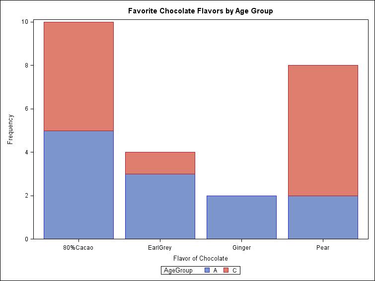
ggplot(chocolate, aes(x = FavoriteFlavor, fill = AgeGroup)) + geom_bar(colour = "black") +
    scale_fill_brewer(palette = "Pastel1") + theme(legend.position = "bottom") +
    xlab("Flavor of Chocolate") + ylab("Frequency") + ggtitle("Favorite Chocolate Flavors by Age Group")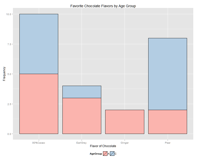
PROC SGPLOT DATA=bikerace;
  HISTOGRAM NumberLaps / SHOWBINS;
  DENSITY NumberLaps;
  DENSITY NumberLaps / TYPE=KERNEL;
  TITLE 'Bicycle Criterium Results';
RUN;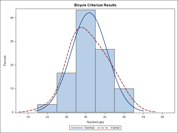
ggplot(bikerace, aes(x = NumberLaps)) + geom_histogram(aes(y = ..density..),
    breaks = breaks, right = TRUE, fill = "cornsilk", colour = "grey60", size = 0.5) +
    geom_density(alpha = 0.2, aes(fill = "#FF6666"), colour = element_blank()) +
    stat_function(fun = dnorm, args = list(mean = mean(bikerace$NumberLaps),
        sd = sd(bikerace$NumberLaps))) + stat_function(fun = dnorm, args = list(mean = mean(bikerace$NumberLaps),
    sd = sd(bikerace$NumberLaps)), geom = "area", alpha = 0.2, aes(fill = "#6666FF")) +
    scale_fill_discrete(labels = c("Normal", "Kernel")) + labs(fill = "Curves") +
    guides(fill = guide_legend(reverse = TRUE)) + theme(legend.position = "bottom") +
    xlim(15, 65) + ggtitle("Bicycle Criterium Results")
PROC SGPLOT DATA=bikerace;
  VBOX NumberLaps / CATEGRORY = Division;
  TITLE 'Bicycle Criterium Results';
RUN;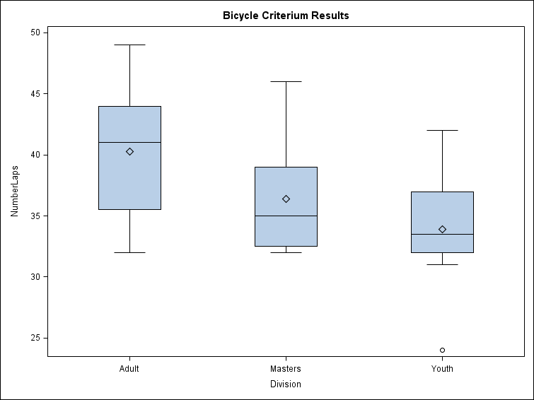
ggplot(bikerace, aes(x = Division, y = NumberLaps, fill = Division)) + geom_boxplot(width = 0.5,
    outlier.size = 3, outlier.shape = 21) + stat_summary(fun.y = "mean", geom = "point",
    shape = 23, size = 3, fill = "white") + scale_fill_brewer(palette = "Pastel2") +
    theme(legend.position = c(1, 1), legend.justification = c(1, 1)) + labs(fill = "Division\nAgeGroup") +
    guides(fill = FALSE) + ggtitle("Bicycle Criterium Results")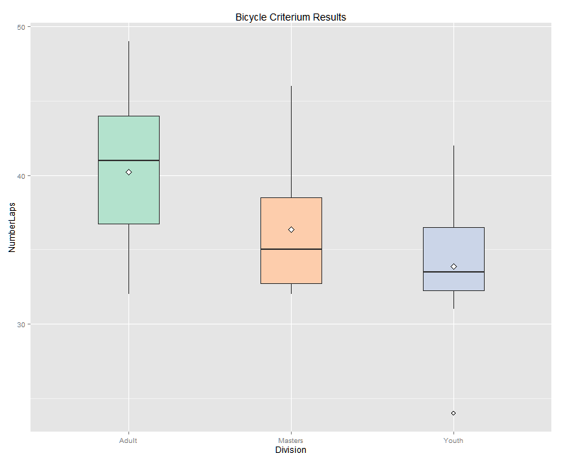
PROC SGPLOT DATA=onionrings;
  SCATTER X = Action Y = BSales;
  SCATTER X = Action Y = Csales;
  XAXIS LABEL ='Hits + Runs' VALUES = (0 TO 40 BY 10);
  YAXIS LABEL ='Number Sold';
  LABEL BSales = 'Sales in Bleachers';
  LABEL CSales = 'Sales at Stands';
  TITLE 'Onion Ring Sales vs. Game Action';
RUN;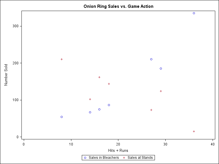
ggplot(mydata, aes(x = Action, y = Count, colour = Sales, shape = Sales)) +
    geom_point(size = 3) + theme(legend.position = "bottom") + scale_x_discrete(breaks = seq(0,
    40, by = 10)) + expand_limits(x = 45) + xlab("Hits + Runs") + ylab("Number Sold") +
    scale_shape_discrete(labels = c("Sales in Stands", "Sales at Bleachers")) +
    scale_colour_discrete(labels = c("Sales in Stands", "Sales at Bleachers")) +
    guides(shape = guide_legend(reverse = TRUE), colour = guide_legend(reverse = TRUE)) +
    ggtitle("Onion Ring Sales vs. Game Action")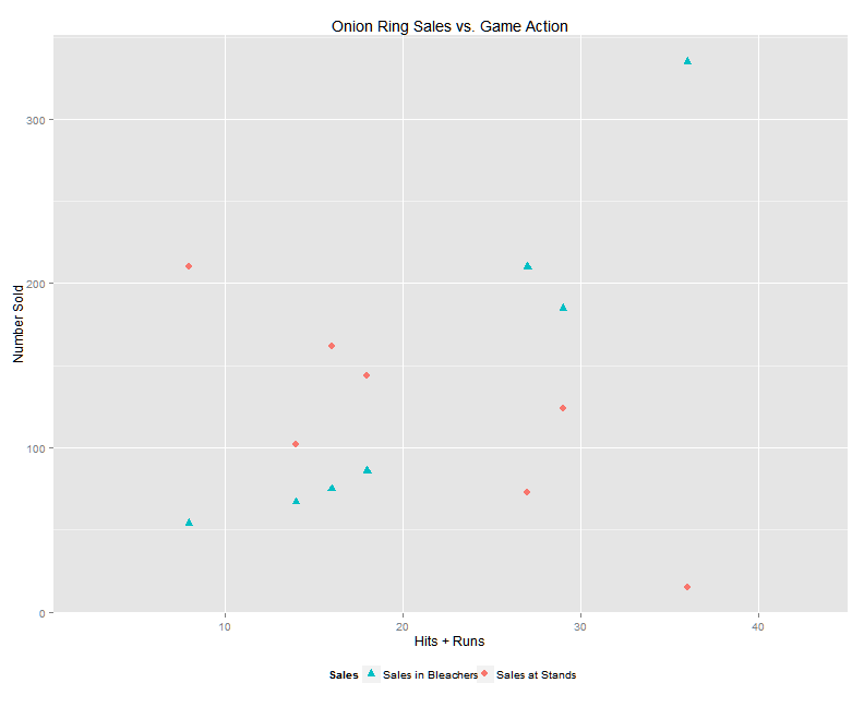
PROC SGPLOT DATA=temperatures;
  SERIES X = Month Y = IntFalls;
  SERIES X = Month Y = Raleigh;
  SERIES X = Month Y = Yuma;
  REFLINE 32 75 / TRANSPARENCY = 0.5 LABEL = ('32 degrees' '75 degrees');
  XAXIS TYPE=DISCRETE;
  YAXIS LABEL = 'Average High Temperature (F)';
  TITLE 'Temperatures by Month for International Falls,  '
                'Raleigh, and Yuma';
RUN;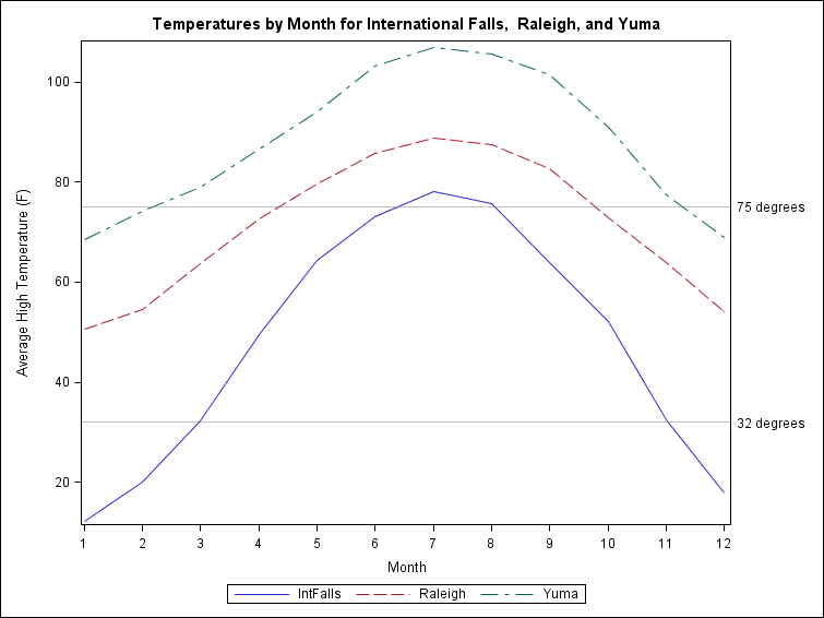
ggplot(mydata, aes(x = Month, y = Temp, linetype = City, colour = City)) + geom_line(size = 1) +
    scale_colour_brewer(palette = "Set1") + scale_x_discrete(breaks = seq(0,
    12, by = 1)) + scale_y_discrete(breaks = seq(0, 100, by = 20)) + expand_limits(y = 110) +
    geom_hline(aes(yintercept = c(32, 75)), alpha = 0.3) + annotate("text",
    x = 12, y = 34.5, label = "32 degrees", alpha = 0.3) + annotate("text",
    x = 12, y = 77.5, label = "75 degrees", alpha = 0.3) + theme(legend.position = "bottom") +
    ggtitle("Temperatures by Month for International Falls, Raleigh, and Yuma")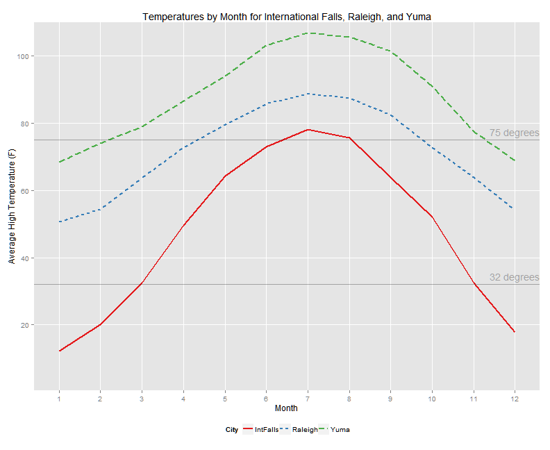
PROC SGPLOT DATA=Olympic1500;
  REG X=Year Y=Men / CLM NOLEGCLM NOMARKERS;
  LOESS X=Year Y=Men / CLM NOLEGCLM;
  YAXIS LABEL='Time in Seconds';
  TITLE "Olympic Times For Men's 1500 Meter Run";
RUN;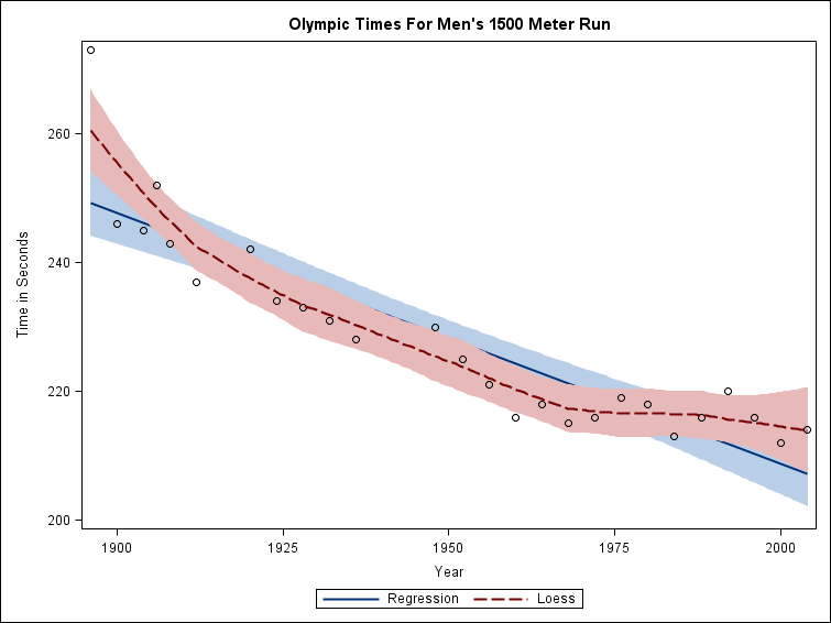
ggplot(Olympics1500, aes(x = Year, y = Men)) + geom_point(colour = muted("green"),
    shape = 21, fill = "yellow", size = 3) + stat_smooth(method = lm, aes(colour = muted("yellow")),
    fill = "grey60", size = 1) + stat_smooth(method = loess, aes(colour = muted("blue")),
    fill = "grey40", size = 1, alpha = 0.2) + scale_x_continuous(breaks = seq(1900,
    2000, by = 25)) + scale_colour_discrete(name = "Fit", labels = c("Loess",
    "Regression")) + theme(legend.position = "bottom") + guides(colour = guide_legend(reverse = TRUE)) +
    ggtitle("Olympic Times for Men's 1500 Meter Run")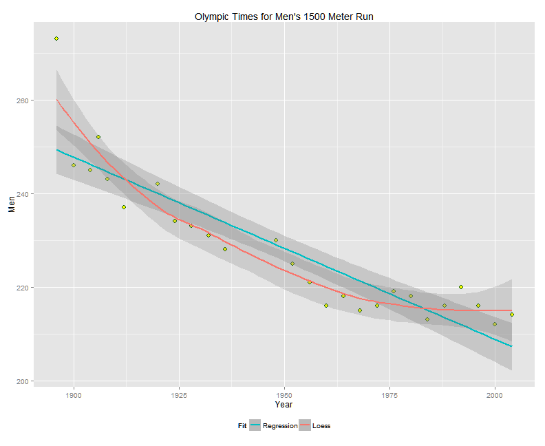
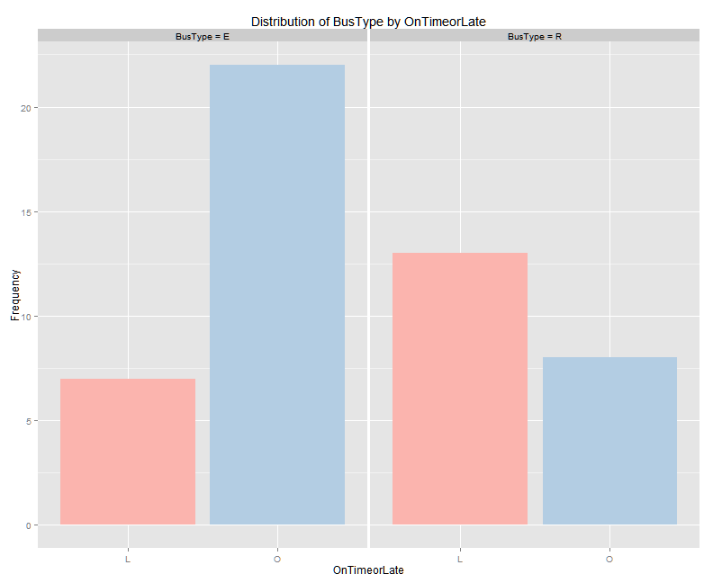
PROC FREQ DATA=bus;
  TABLES BusType*OnTimeOrLate / PLOTS=FREQPLOT(TWOWAY=GROUPHORIZONTAL);
RUN;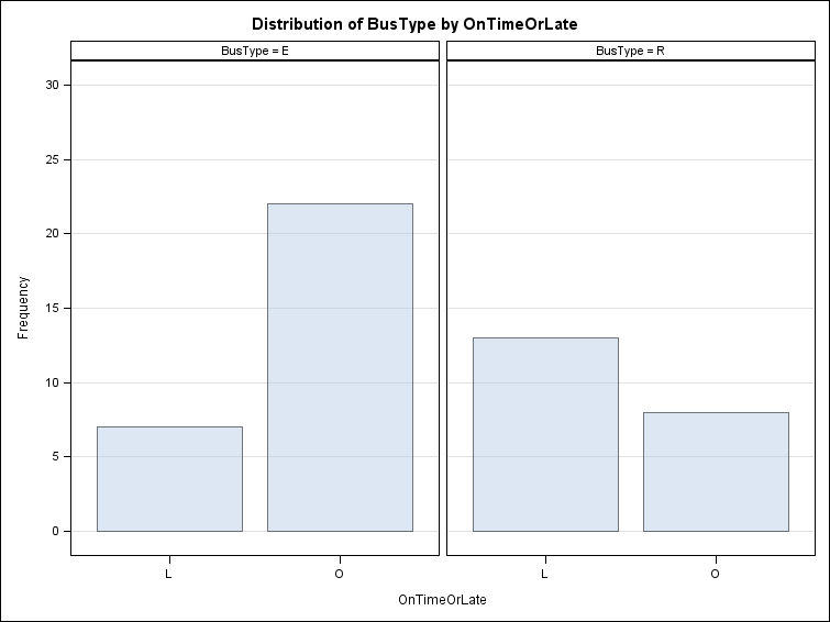
ggplot(bus, aes(x = OnTimeorLate, fill = OnTimeorLate)) + scale_fill_brewer(palette = "Pastel1") +
    geom_bar() + facet_grid(. ~ BusType) + ylab("Frequency") + guides(fill = FALSE) +
    ggtitle("Distribution of BusType by OnTimeorLate")